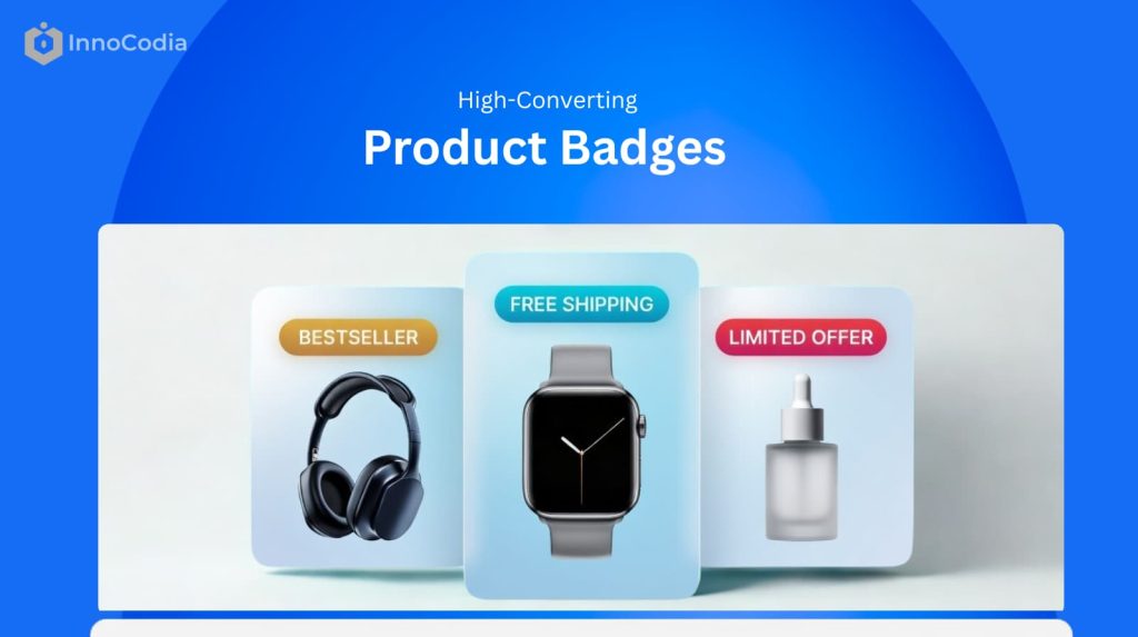
You know what product badges are.
You even know the different types of badges you can use.
But here’s the million-dollar question:
What do high-converting ecommerce product badging examples actually look like in real WooCommerce stores?
Because theory is one thing. Seeing how successful WooCommerce stores use badges to drive real-world sales is something else entirely. It’s how you go from knowing about badges to knowing how to use them effectively.
And in this guide, I’m going to show you 12 real-world ecommerce product badge examples. I’ll break down why each one works and how you can apply the same strategies to your own WooCommerce store.
Let’s get to it.
The Anatomy of a High-Converting Product Badge
Before we dive into the ecommerce product badging examples, let me clarify something:
A product badge doesn’t convert because it looks good.
It converts because it shifts perception.
High-performing WooCommerce stores don’t use badges as decoration. They use them as micro-conversion triggers.
In my experience optimizing ecommerce stores, a high-converting product badge consistently does three things:
1. It Grabs Attention
It creates visual contrast within the product grid or product page.
Through color, shape, placement, or motion — it interrupts scanning behavior and forces a micro-pause.
2. It Communicates Immediate Value
In less than a second, it answers the shopper’s subconscious question:
“Why should I care about this product right now?”
Whether it signals urgency, exclusivity, savings, popularity, or trust — the value must be instantly clear.
3. It Prompts Action
A strong badge nudges the user forward in the buying journey.
It reduces hesitation.
It creates urgency.
It increases click-through from product grid to product page — and from product page to cart.
That’s the framework.
As we go through the following ecommerce product badging examples, evaluate each one through these three lenses:
Attention.
Value.
Action.
Because once you understand the anatomy, you stop copying badges.
And start engineering them.
12 High-Converting Ecommerce Product Badging Examples
Urgency & Scarcity Badge Examples
These badges create FOMO (Fear of Missing Out) and are designed to make shoppers act fast.
1. The “Only X Left” Badge
This is the most powerful scarcity badge in ecommerce product badging.
But only when used correctly.
Why It Works (Conversion Psychology)
Specific scarcity beats vague scarcity.
“Limited stock” is ignorable.
“Only 2 left” creates tension.
The human brain processes specific numbers as real constraints. It forces a mental shift:
From:
“I’ll come back later.”
To:
“If I leave, I might lose this.”
That micro-fear increases click-through rate from category pages and reduces decision delay on product pages.
In several WooCommerce stores I’ve analyzed, low-stock badges increased product page CTR by double digits — especially for fashion, electronics, and seasonal products.
Where It Works Best
- High-demand products
- Trending items
- Seasonal inventory
- Limited restocks
It performs strongest when shoppers already have moderate purchase intent.
Common Mistake
Fake scarcity destroys trust.
If every product shows “Only 3 left” — customers notice.
And once trust drops, conversion drops harder.
Scarcity must be tied to real inventory logic.
Implementation Strategy
Instead of manually tagging products, use dynamic rules.
For example:
Trigger the badge only when stock < 5 units
Remove it automatically once restocked
That way your ecommerce product badging stays accurate and scalable.
(If you’re using WooCommerce, tools like Better Badge can automate this condition-based display without touching code.)
2. The “Flash Sale” Badge
Flash sale badges are urgency on steroids.
But here’s what most stores get wrong:
They use them too often.
Why It Works
“Flash Sale” signals two things instantly:
- Deep discount
- Very limited time
That combination triggers loss aversion. The shopper isn’t just saving money — they’re avoiding missing out on a rare opportunity.
When implemented correctly, flash sale badges can spike short-term revenue dramatically. They work especially well during:
- Inventory clearance
- Seasonal transitions
- Promotional events
- Traffic spikes from paid campaigns
Where It Works Best
Flash sales perform best at the middle and bottom of the funnel, when users are already browsing product pages.
It’s less effective on cold traffic unless paired with a countdown or strong discount.
Common Mistake
If everything is always on “Flash Sale,” nothing feels urgent.
Overuse trains customers to wait.
Implementation Strategy
Use rule-based scheduling:
- Display badge only during specific time windows
- Pair with countdown timers
- Remove automatically after expiration
This keeps your ecommerce product badging aligned with real urgency instead of fake hype.
(Image: An electronics store’s homepage featuring several products with a sizzling, lightning-bolt-themed “Flash Sale” badge.)
Sale & Discount Badge Examples
These are the workhorses of e-commerce. Their goal is to attract bargain hunters and highlight value.
3. The Specific Percentage “OFF” Badge
This is one of the most common product badging examples.
But specificity is what makes it powerful.
Why It Works
“Sale” is abstract.
“40% OFF” is concrete.
Concrete numbers reduce cognitive friction. Shoppers instantly calculate savings in their head. That instant clarity increases click probability on category pages.
Strategic Insight
Percentage badges work best when:
- Discount is meaningful (15%+)
- Price comparison is visible
- Original price is crossed out
The brain loves contrast.
Common Mistake
Stacking too many visual elements:
- Discount badge
- Countdown timer
- Free shipping badge
- Best seller ribbon
Clutter kills attention.
Badges should amplify the product — not compete with it.
4. The “Clearance” Badge
Clearance is stronger than “Sale.”
It signals finality.
Why It Works
Clearance communicates:
- Deep discount
- No restock
- Last opportunity
It taps into both urgency and value perception.
In ecommerce product badging strategy, this is ideal for:
- End-of-season inventory
- Discontinued SKUs
- Low-margin stock needing liquidation
Psychological Layer
“Clearance” reframes the purchase as a smart financial decision.
The buyer feels strategic — not impulsive.
Social Proof Badge Examples
These badges leverage the power of the crowd to build trust and signal quality.
5. The “Best Seller” Badge
This is social proof at scale.
Among all product badging examples, this one consistently improves trust signals.
Why It Works
It answers an unspoken question:
“Is this a safe choice?”
When shoppers don’t know your brand, they default to what others chose.
That’s herd behavior psychology in action.
Where It Works Best
- Category pages
- Product grids
- Landing pages with multiple options
It reduces decision fatigue.
Advanced Strategy
Base it on real sales volume within a defined timeframe:
- Last 30 days
- Last quarter
- Top 5% category sellers
That keeps the signal authentic.
6. The “Top Rated” Badge
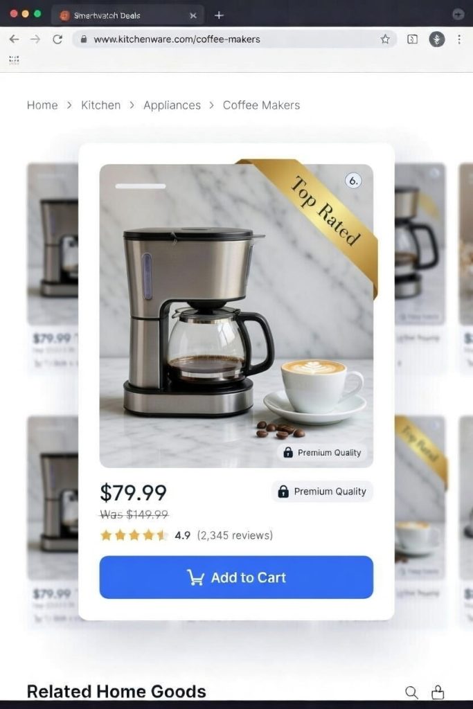
This is quantified social proof.
It blends authority and data.
Why It Works
A badge that says:
“4.8 ★ Top Rated”
is persuasive because it combines:
- Visual validation
- Numerical credibility
Star ratings reduce risk perception.
Especially for:
- High-ticket products
- Technical items
- First-time purchases
Common Mistake
Displaying ratings without review count.
“5 stars” with 3 reviews doesn’t convert like:
“4.7 stars (1,243 reviews)”
Credibility matters.
Newness & Exclusivity Badge Examples
These badges generate excitement and make shoppers feel like they’re getting something special.
7. The “New Arrival” Badge
Newness creates curiosity.
And curiosity drives clicks.
Why It Works
It signals freshness.
For returning customers, this badge answers:
“What’s new since my last visit?”
It boosts visibility for new SKUs that haven’t yet built sales or reviews.
Strategic Use
Keep the badge temporary.
7–30 days maximum.
After that, remove it.
Otherwise, everything becomes permanently “new,” which kills credibility.
8. The “Limited Edition” Badge
This one increases perceived value — not just urgency.
Why It Works
Limited edition items trigger exclusivity bias.
Shoppers feel:
- Unique
- Early
- Part of something rare
This is powerful in:
- Fashion
- Luxury goods
- Collectibles
- High-end electronics
Advanced Strategy
Number the units if possible:
“Limited Edition — 1 of 500”
Specificity increases desirability.
(Image: A high-end watch with a sophisticated, metallic “Limited Edition” badge placed discreetly in the corner of the image.)
Trust & Value Badge Examples
These badges are designed to overcome common buying objections, like shipping costs or return policies.
9. The “Free Shipping” Badge
Shipping cost is the #1 cart abandonment driver.
This badge directly removes friction.
Why It Works
It eliminates uncertainty.
Even if shipping is built into the price, the phrase “Free Shipping” simplifies the buying decision.
In ecommerce product badging strategy, this is friction reduction — not hype.
Where It Works Best
- Product pages
- Cart threshold messaging
- Bulky or heavy products
(Image: A product page for a bulky furniture item. A bright green badge reassuringly states, “Free Shipping.”)
10. The “Eco-Friendly” or “Organic” Badge
This badge filters your audience instantly.
Why It Works
For value-driven buyers, sustainability isn’t a bonus.
It’s a requirement.
This badge helps conscious shoppers identify aligned products immediately.
Important
Back it with proof.
Certifications, sourcing transparency, or product details.
Empty claims reduce trust.
(Image: A grocery store’s product grid showing a bag of coffee with a green, leaf-themed “Organic” badge.)
Informational & Gifting Badge Examples
11. The “Pre-Order” Badge
Pre-order badges convert anticipation into revenue.
Why It Works
It communicates:
“This product is coming — secure yours now.”
It works extremely well for:
- Product launches
- Gaming
- Books
- Limited drops
Strategic Benefit
It helps forecast demand.
It also reduces launch-day server pressure by distributing sales earlier.
(Image: A video game or book cover with a bold “Pre-Order Now” badge.)
12. The “Staff Pick” Badge
This one adds human warmth.
It’s subtle but powerful.
Why It Works
It feels curated.
Unlike algorithmic labels, “Staff Pick” implies expertise.
That matters when:
- Products are complex
- Shoppers feel overwhelmed
- Choice overload exists
Advanced Use
Add a short explanation:
“Staff Pick — Our team’s favorite for sensitive skin.”
Context increases conversion power.
(Image: A wine bottle on a retailer’s site with a rustic, handwritten-style “Staff Pick” badge.)
How to Choose the Right Product Badge
One of the biggest mistakes I see in ecommerce product badging?
Random stacking.
Badges aren’t stickers.
They’re psychological triggers.
Before adding any badge, ask a single question:
What is the primary barrier to purchase for this product?
Then match the trigger to the friction.
- Price sensitivity → Use discount framing (percentage OFF, clearance)
- Trust hesitation → Use social proof (Best Seller, Top Rated)
- Urgency gap → Use scarcity (Only X Left, Limited Edition)
- Shipping objection → Use friction-reduction (Free Shipping)
Every product solves a different problem.
Which means every product may require a different trigger.
Uniform badging across your entire store reduces impact because repetition removes psychological weight.
Strategic ecommerce product badging is contextual — not decorative.
Implementation Considerations for WooCommerce
Here’s the practical reality.
WooCommerce does not provide advanced conditional badge logic natively.
If you want to execute real conversion-focused product badging examples — not just static labels — you need structured control.
For example:
- Stock-based rules
- Category-based targeting
- User-role personalization
- Time-based activation
- Campaign scheduling
Without rule-based logic, you’re manually editing labels.
And manual systems break at scale.
A structured badge system allows you to:
- Automate scarcity when stock drops
- Schedule flash campaigns in advance
- Avoid human errors
- Maintain visual consistency across templates
Tools like Better Badge provide targeting logic instead of static overlays — which aligns with strategic ecommerce product badging implementation.
But let me be clear:
Tools are secondary.
Strategy comes first.
If the trigger is wrong, automation only amplifies the mistake.
Common Product Badging Mistakes
Even strong stores get this wrong.
Here are the patterns I consistently see when auditing ecommerce product badging:
1. Too Many Badges on One Product
Stacking urgency, discount, best seller, free shipping, and new arrival together creates noise.
Cognitive overload reduces clicks.
2. Inconsistent Color Hierarchy
If every badge is bright red, nothing stands out.
Color should communicate priority.
3. Fake Urgency
“Only 2 left” for 6 months destroys trust.
Artificial scarcity damages long-term brand equity.
4. Static “Best Seller” Labels
If a product carries that badge forever, customers eventually ignore it.
Social proof must be dynamic.
5. Ignoring Mobile Visibility
Many product badging examples look great on desktop but overlap images on mobile.
Overlapping CTAs on small screens silently kills conversions.
Badges should clarify decisions.
Not clutter them.
Ready to Create Your Own High-Converting Badges?
As you can see, the most effective product badges are strategic. They are used with a clear purpose, whether it’s to create urgency, build trust, or highlight value.
The key is to think from your customer’s perspective. What information would make their decision easier? What would get them excited to buy?
Turn that answer into a badge.If you’re running a WooCommerce store, you don’t need to be a designer or a coder to implement these examples. A tool like Better Badge comes with over 100 pre-made templates and powerful targeting rules, allowing you to replicate these high-converting strategies in minutes.