You have stocked your store, uploaded the products, and brought people to your website. But too many visits still end without an order.
Think about walking into Target. Now imagine the coats, coffee mugs, and skincare products all mixed together, with no signs to guide you. Where would you even start? Thankfully, their products are organized into clear sections, so you know where to find what you need.
Your online store needs that same care.
Can shoppers find the right product, compare their options, and spot your offers?
You know your catalog. They do not.
Ecommerce merchandising helps you close that gap. We’ll cover why it matters, practical strategies, and examples, then help you decide where to start in your own store.
What Is Ecommerce Merchandising?
Ecommerce merchandising is the process of organizing, presenting, and promoting products in an online store to help shoppers discover relevant items and make purchase decisions.
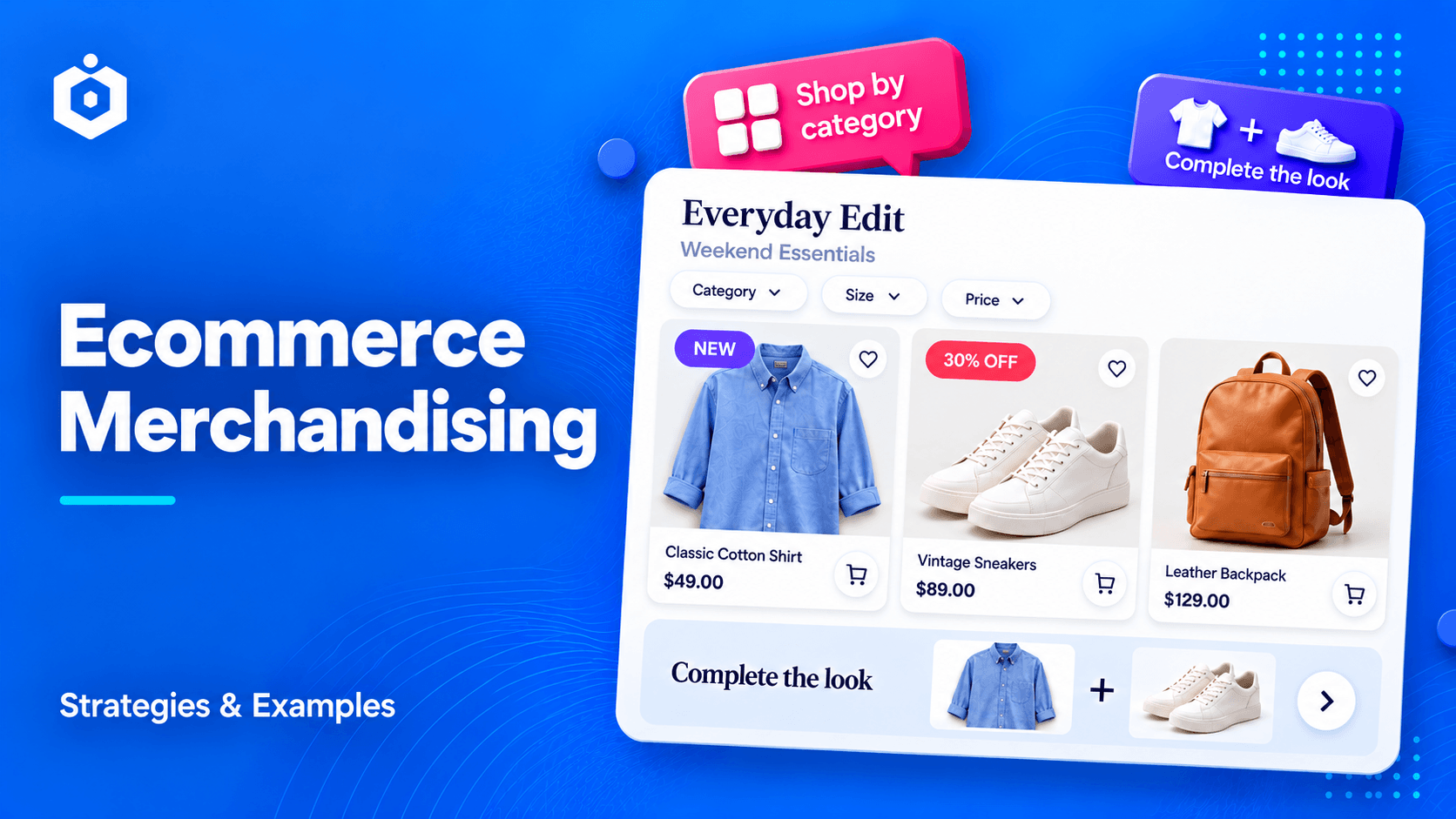
It includes the categories you create, the products you feature, the information you show, and the recommendations you make. Your navigation, search, collections, product cards, and product pages work together to guide shoppers through those choices.
Shopify puts the purpose simply:
At its core, ecommerce merchandising makes shopping online easy for customers.
That is a useful starting point. Before adding another banner or recommendation section, ask: does this make choosing easier?
The Main Components of Ecommerce Merchandising
Component
What it includes
The shopper’s question it helps answer
Product organization
Categories, collections, navigation, search, and filters
“Where can I find what I need?”
Product presentation
Images, descriptions, prices, reviews, and labels
“Is this the right product for me?”
Product placement
Featured products and the order of items in a collection
“Which options should I look at first?”
Product promotion
Offers, seasonal collections, bundles, and recommendations
“Is there a relevant deal or another item worth considering?”
These parts work together. A helpful collection brings shoppers to suitable products. Good product information helps them compare. Clear offer labels make relevant savings easier to notice.
Ecommerce Merchandising Example: Two Clothing Stores Compared
Suppose you sell clothing, and a customer visits your store looking for a warm coat.
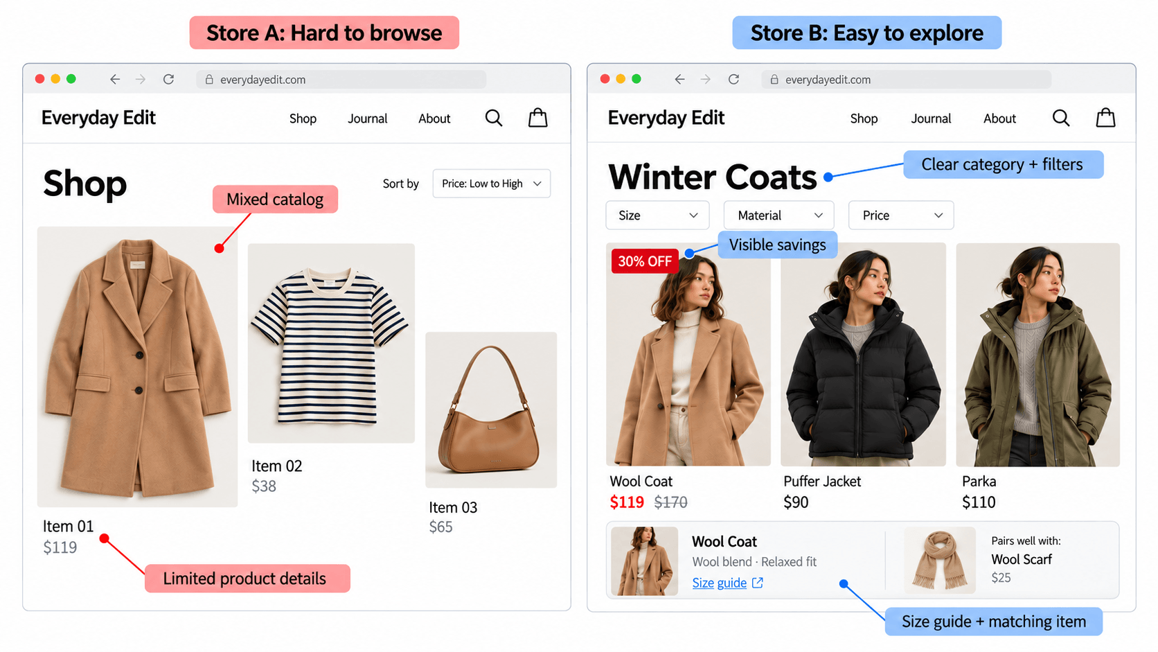
Store A puts every clothing item into one large “Shop” page. Coats appear between summer tops and accessories. Customers can sort by price, but there are no filters for size or material. Product names are vague, and the photos do not show the coats being worn.
Your customer opens several products and checks each description to work out which coat is warm enough. You might have exactly what they need, but they have to find it themselves.
Store B has a “Winter Coats” category. Customers can filter by size, length, material, and price. In-stock coats appear first. Each product explains its fabric, fit, and intended use, with photos showing it being worn.
Discounted coats have a readable savings label. Customers can check the size guide and see a matching scarf on the product page.
Both stores could sell the same coats at the same prices. Store B makes it easier for customers to choose one.
Ecommerce Merchandising vs. Marketing
Marketing helps people discover your store and gives them reasons to visit. Merchandising helps guide their product choices while they shop.
For example, you send an email promoting your winter sale. That is marketing. When shoppers click the link, they land on your sale page. Choosing which products appear first, what details to show, and how to highlight discounts is merchandising.
There is overlap. A campaign landing page does both jobs. What matters is that the promise in your marketing matches the experience shoppers find after clicking.
Benefits of Ecommerce Merchandising for Your Online Store
You know your catalog inside out. A new visitor does not.
They do not know your internal product names, which items fit together, or where you have hidden the size guide. They may also be comparing your store with two others on their phone.
Good merchandising can help in four practical ways.
It makes products easier to discover. Clear categories and useful filters reduce the amount of searching someone needs to do.
It helps shoppers make informed decisions. Accurate images, useful descriptions, and relevant reviews answer questions before those questions become reasons to leave.
It makes the path to purchase clearer. A shopper who understands the product, price, and offer has fewer loose ends to resolve.
It creates opportunities for useful additional purchases. A compatible accessory or a well-explained bundle can help someone complete their purchase in one place.
Merchandising works alongside your prices, product quality, stock, and checkout. It helps customers understand what you sell; it cannot make up for an unsuitable product or a payment error.
A good product is easier to buy when the store makes it easier to understand.
8 Ecommerce Merchandising Strategies for Your Online Store
You do not need to rebuild your entire store to get started. Choose one important category, look for the biggest obstacle, and work from there.
1. Organize Product Categories and Collections Around Customer Needs
Customers usually arrive with a need. They may want a work bag, a gift under $40, or shoes for trail running.
Your categories should lead them to products that fit that need.
Start with clear product types. Then add collections that bring together items for a purpose, season, or occasion.
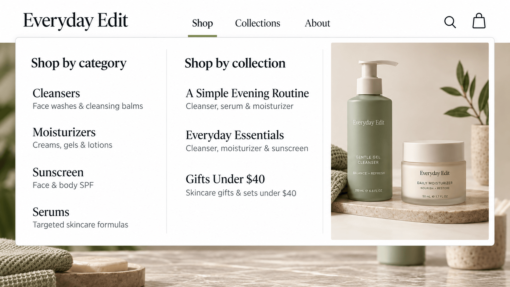
For a skincare store, “Cleansers” and “Moisturizers” could be regular categories. “A Simple Evening Routine” could be a collection you put together.
Categories group products by type. Collections bring products together around a routine, occasion, budget, or other shared purpose.
Keep labels understandable. A creative collection name might sound attractive, but a new visitor may not know whether it contains clothes, cosmetics, or home accessories. Add a clear explanation or choose a more descriptive name.
Also check the route back. If someone opens a product, can they easily return to its collection or explore similar items?
Try this: Ask someone unfamiliar with your store to find a product for a specific purpose. Watch where they hesitate. Let them explore before explaining the navigation.
If you have to say, “Oh, that is actually under this menu,” you have found something worth improving.
2. Improve Ecommerce Product Search and Filters
A search box is a promise: tell us what you need, and we will help you find it.
Test whether your store keeps that promise.
Search for common product names, everyday descriptions, and likely misspellings. Check whether the results make sense and whether an empty result page gives the shopper somewhere useful to go.
Someone typing “work bag” should not need to know that your product is named “The Metropolitan Carryall.”
Help customers while they type, too. If your search tool supports autocomplete, show useful product or category suggestions. Someone typing “wireless” could see “wireless headphones” before finishing the search.
Check common synonyms. Customers may search for “couch” while your catalog uses “sofa.” Your search should connect those terms when they refer to the same products.
An empty results page should offer a next step: check the spelling, try a broader term, or browse a related category. “No results” on its own leaves the customer stuck.
For a larger catalog, personalized results may be worth testing. Start by fixing basic search problems first. Showing someone the wrong products faster is still showing them the wrong products.
Then review your filters. Useful filters depend on the product.
Product category
Filters worth considering
Running shoes
Size, terrain, fit, price, and availability
Headphones
Connection type, noise cancellation, battery life, and price
Furniture
Dimensions, material, color, and price
Laptops
Processor, RAM, storage, screen size, and price
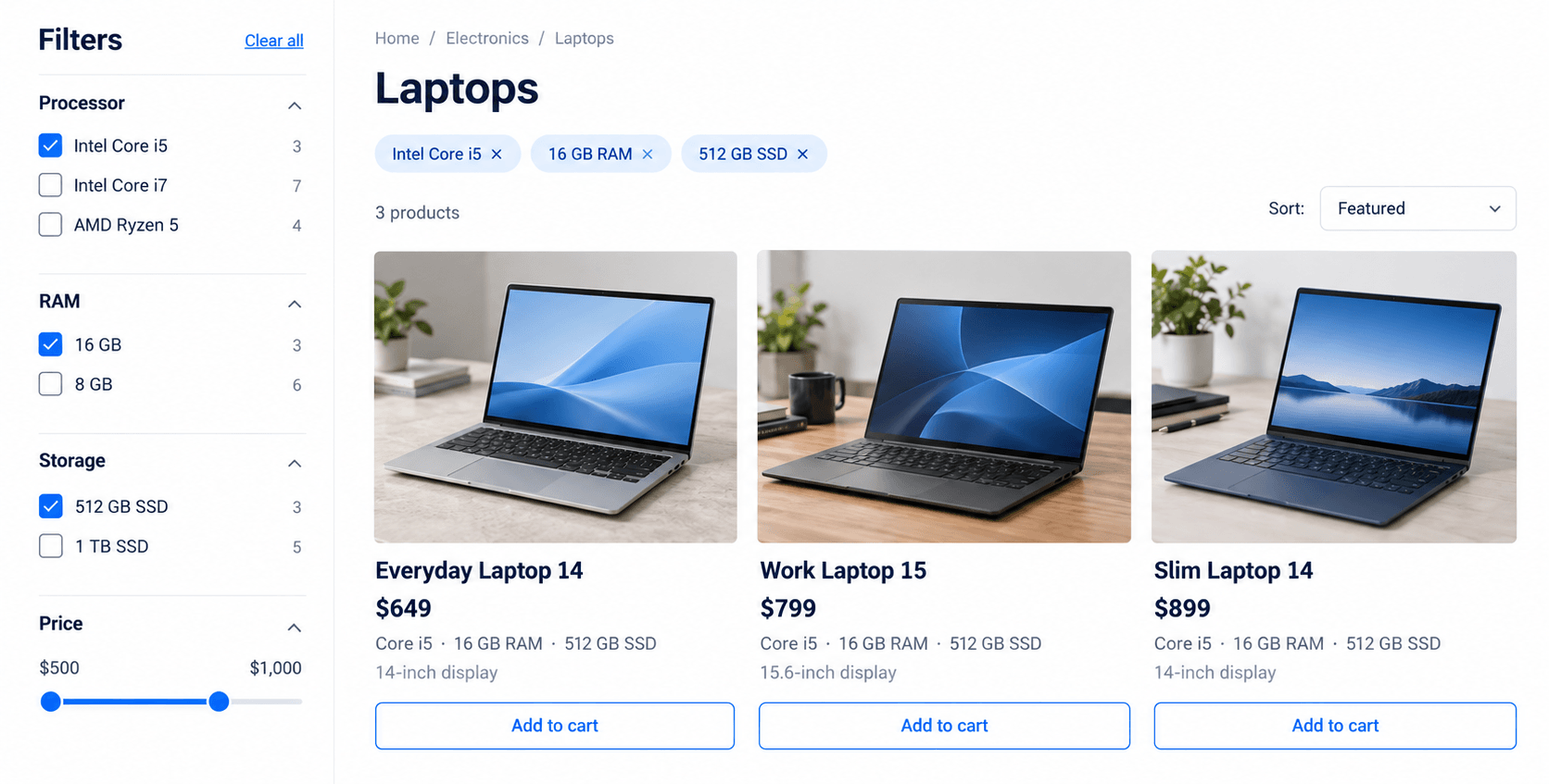
For example, a laptop shopper might want an Intel Core i5 processor, 16 GB of RAM, and a 512 GB SSD. Selecting those filters should show laptops that match, without requiring them to open every product.
Keep selected filters visible and easy to remove, as shown above. Shoppers should be able to adjust one choice without starting over.
Only include filters backed by accurate product details. If a laptop appears under “16 GB RAM” but its description says “8 GB,” shoppers cannot trust the results.
On mobile, check that shoppers can open the filters, apply their choices, and remove them easily. Make sure the “Apply” button stays visible and within reach.
Try this: Pick a category with many products. Identify the three questions shoppers use to narrow their choices, then check whether your filters answer them.
3. Improve Product Images and Descriptions
“Premium quality. Stylish design. Perfect for everyone.”
That sounds pleasant. It also tells us almost nothing.
Useful product content answers the questions a buyer would ask if they could hold the item or speak to someone in a shop.
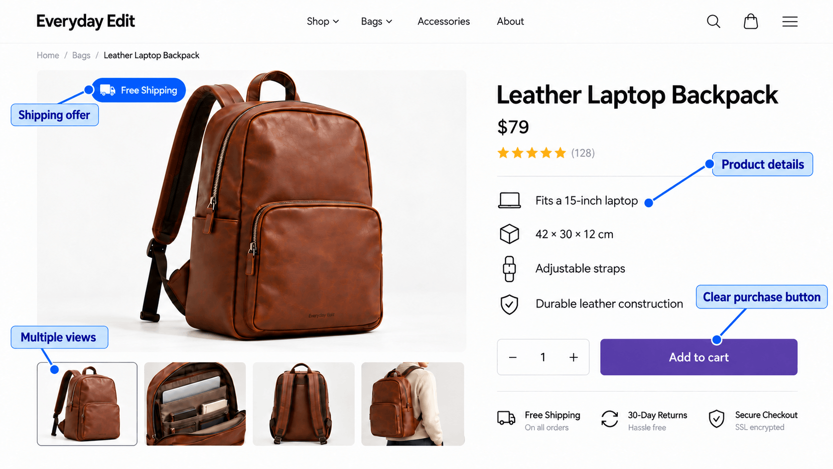
For a bag, show its dimensions, material, compartments, and what fits inside. For a lamp, explain its size, power requirements, and whether a bulb is included. For clothing, provide measurements and care instructions.
Your photos should do part of that work.
Include a clear main image, relevant angles, close-ups, and a photo that shows scale or use. A chair photographed in an empty white space can look beautiful. A chair beside a table helps someone understand its size.
Write descriptions around practical value. “Adjustable shoulder strap” is a feature. Explaining that the strap lets someone change how the bag sits makes the feature easier to evaluate.
Keep important facts easy to scan. Shoppers should not need to read a long story to discover whether a case fits their phone.
Use Product Videos When Photos Leave Questions Unanswered
A photo shows what a product looks like. A short video can show what it does.
If you sell a folding table, demonstrate how it opens and locks. For a bag, show the compartments and pack a few everyday items inside. For clothing, show how the fabric moves when someone walks.
Choose one buying question and answer it clearly. You do not need a dramatic soundtrack to prove that a drawer opens.
Place the video near the relevant photos or details. Give it captions for spoken information, and keep essential facts in the written description too. Customers should be able to understand the product without playing it.
Check loading and playback on a phone. A useful demonstration should not make the rest of the page difficult to browse.
Try this: Review customer questions, support messages, and return reasons. Answer a recurring question on the product page. If it concerns movement, assembly, or use, consider a short demonstration video.
4. Use Product Placement and Sorting to Guide Browsing
The first row of a collection deserves a little thought.
If it is filled with unavailable products, irrelevant items, or products that do not match the collection’s promise, shoppers have to work past it.
Choose what appears first by checking what customers need, what is in stock, and what suits the season. Use your sales data to help decide.
For example, a summer collection should feature suitable, available products. A gift collection should make useful choices visible at the budgets you advertise.
You may want to give a high-margin product more visibility. That can be reasonable, but it still needs to fit what the shopper came to find.
Use default sorting carefully. Alphabetical order may help in some catalogs. In others, an order you choose may provide a more useful introduction. Let shoppers change the sort when they need a different view.
Do not bury a product only because it is new and has no sales history. It may need a fair opportunity to be seen before you can judge its performance.
Use Your Homepage to Guide Product Discovery
Your homepage should help visitors choose where to go next.
Show a few clear routes, such as “Shop Winter Coats,” “Gifts Under $40,” or “Explore New Arrivals.” Feature products that match those routes and are available to buy.
If you promote free shipping or a sale, show the conditions close to the message. Then check that each banner leads to the collection it promises.
Try this: Open your three busiest collections. Look at the first visible row on mobile. Would those products make sense to a first-time visitor?
5. Use Product Badges for Ecommerce Visual Merchandising
Think about how you scan a product grid. You probably notice the image and price first, then look for anything that helps you judge the item quickly.
A short product badge can provide that extra piece of information.
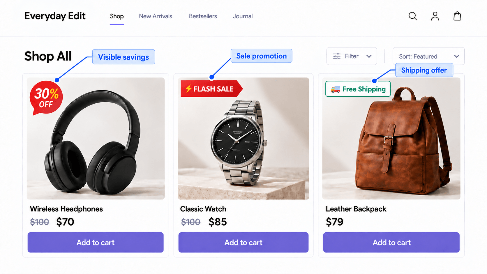
“30% OFF” makes savings visible. “New Arrival” identifies a recent addition. “Only 3 Left” communicates stock availability when the count is accurate.
And even you and I have been drawn to that “Free Shipping” label so many times, right? xD
Sometimes that tiny label is the reason we open one product before the product beside it.
Product badges make details visible in the grid, before customers open a product page.
For a merchandising example, imagine a small product grid with three different messages:
Product situation
Possible badge
What to check
A product has a genuine price reduction
30% OFF
The percentage matches the actual prices
A recently added product is featured
New Arrival
The label is removed when it is no longer new
A product qualifies for free delivery
Free Shipping
The offer applies under the stated conditions
The badge communicates the offer. You still need to configure the actual prices, shipping rules, or other offer conditions separately.
If free shipping requires a minimum order, make that clear. If you label something “Best Seller,” base it on real sales information. Shoppers should be able to trust what the label says.
Keep the design simple and readable. Use a short message, enough contrast, and a position that leaves the product visible.
If every product has “HOT,” “SALE,” “BEST,” and “HURRY,” the grid starts looking like all the products are shouting at once.
One useful label often gives the shopper more clarity than four competing ones.
Try this: Choose a collection where an important offer is hard to notice. Add one accurate, readable label to the relevant products, then compare product clicks and purchases.
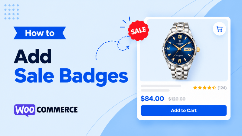
Want to try this in WooCommerce? Our guide on adding product sale badges walks through the setup with Better Badge.
6. Add Relevant Product Recommendations and Bundles
Recommendations should feel helpful. A random list of items underneath a product rarely explains why someone should consider them.
Start by deciding what job the recommendation is doing.
An alternative gives the shopper another option for the same need. Someone comparing a desk lamp might want a smaller lamp at a lower price.
A complementary product helps them use or complete their original choice. A camera buyer may need a compatible memory card or carrying case.
A bundle groups products into one offer. A desk setup bundle might include a lamp, desk mat, and organizer, with the contents and price clearly explained.
Compatibility matters. Recommending the wrong cable or accessory creates a problem instead of solving one.
Do not assume shoppers know why products belong together. A short line such as “Fits this camera model” or “Complete your desk setup” can make the relationship clear.
A recommendation can be useful without being personalized. You might show the same matching scarf to everyone viewing a coat.
Personalization changes the selection using relevant information, such as a shopper’s previous purchases or browsing activity. A returning customer might see more products from a category they regularly buy.
For a small store, start with recommendations that make sense for any shopper. Consider personalization when your catalog, customer data, and tools can support it.
Try this: Pick five popular products. For each one, identify one useful alternative and one item that works with it.
7. Use Customer Reviews and Photos on Product Pages
Reviews are most useful when they answer a question.
“Great product!” is encouraging. “Fits my 15-inch laptop without bending the corners” tells a bag shopper something practical.
Make product-specific reviews accessible where people are evaluating the product. Let shoppers explore feedback about size, fit, comfort, durability, or other relevant concerns when your review system supports it.
Customer photos can help show how a product looks in an ordinary setting. A lamp in a real bedroom or a coat worn by a customer provides a different perspective from a studio image.
Use genuine reviews and permission-based photos. Keep useful criticism visible too. A shopper may learn that a shoe runs small and choose a better size because someone mentioned it.
Be precise with ratings. A store-wide rating should not look like a rating for a specific product.
Try this: Find one product where customers often ask about fit, size, or appearance. Make the relevant reviews and photos easier to find on that page.
8. Plan Seasonal Merchandising and Sale Collections
Your store should reflect the offer shoppers were promised.
If an email promotes a Black Friday collection, the linked page should show that collection clearly. The product selection, prices, and labels should match the campaign.
Keep Your Campaign’s Product Presentation Consistent
Use the same offer wording across your email, collection page, and product labels. If the email says “Selected coats: 30% off,” the collection should make those eligible coats easy to identify.
Keep product photos, badge styles, and colors consistent enough that the page feels like one collection. Give shoppers a clear visual pattern, so they can compare products without relearning the layout of each card.
You can change the styling for a seasonal campaign while keeping prices, conditions, and product details easy to read.
For a seasonal sale, review the collection, product order, promotional labels, stock, and related recommendations. On mobile, check whether the offer is understandable without opening every product.
Plan the ending too. Expired sale labels and old campaign banners can make your store confusing after the promotion finishes.
If you schedule badges, align their display period with the underlying offer and check the relevant timezone. The label and the actual discount should tell the same story.
Evergreen collections also need attention. Update a “Gifts Under $30” collection when prices change. Remove unavailable products from a featured gift selection or provide clear alternatives.
Try this: List what needs updating before your next sale and what needs removing afterward. Include prices, banners, featured products, and badges so nothing gets missed.
Ecommerce Merchandising Examples: Fashion, Electronics, and Skincare
These illustrative store examples show the strategies working together. They are not measured brand case studies.
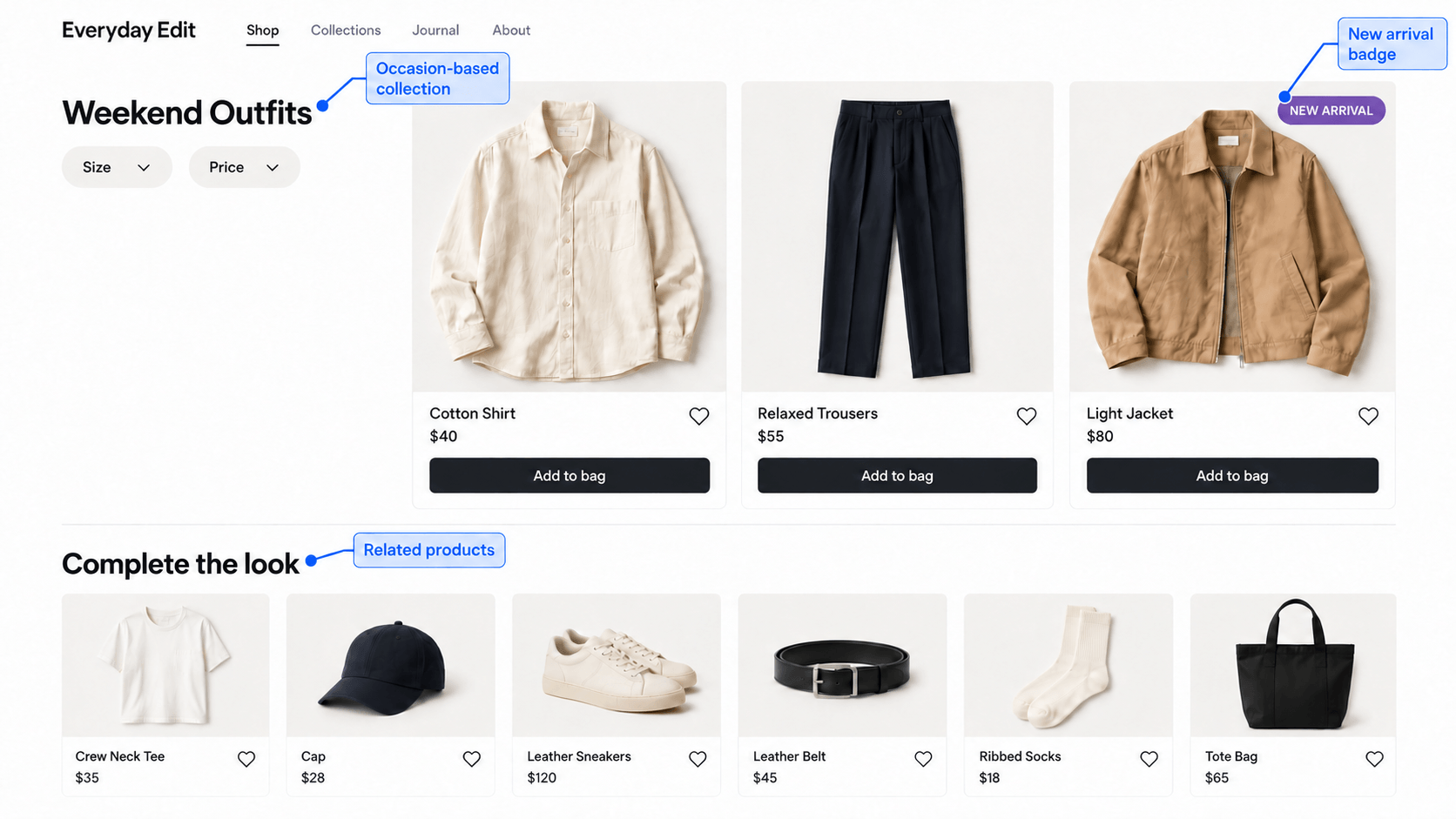
Example 1: Fashion Merchandising With Outfit Collections
Imagine a shopper looking for something to wear to a weekend outing. They do not have a specific product in mind yet.
A store gives them a “Weekend Outfits” collection with a short explanation of the style. The selection includes tops, trousers, and layers that work together. Useful size and price filters help them narrow it down.
When they open a shirt, the page shows how it fits, provides measurements, and recommends the trousers used in the outfit photo.
The shopper can move from an outfit idea to choosing the individual pieces without starting a separate search for each one.
What to borrow: Build a collection around a real occasion, then make it easy to move from inspiration to individual products.
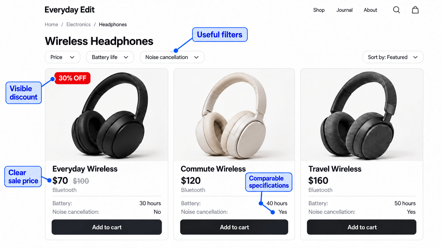
Example 2: Electronics Merchandising With Product Comparisons
A shopper wants wireless headphones for commuting. They care about battery life, noise cancellation, comfort, and price.
The store offers filters for relevant features. Product cards show concise specifications, ratings where available, and accurate discount labels.
On each product page, the shopper can find battery details, connection information, and what is included in the box. Compatible accessories appear separately.
The discount catches their attention, but the product information helps them decide whether the deal suits their needs.
What to borrow: Show the offer alongside the facts people need to compare. A large discount cannot explain compatibility.
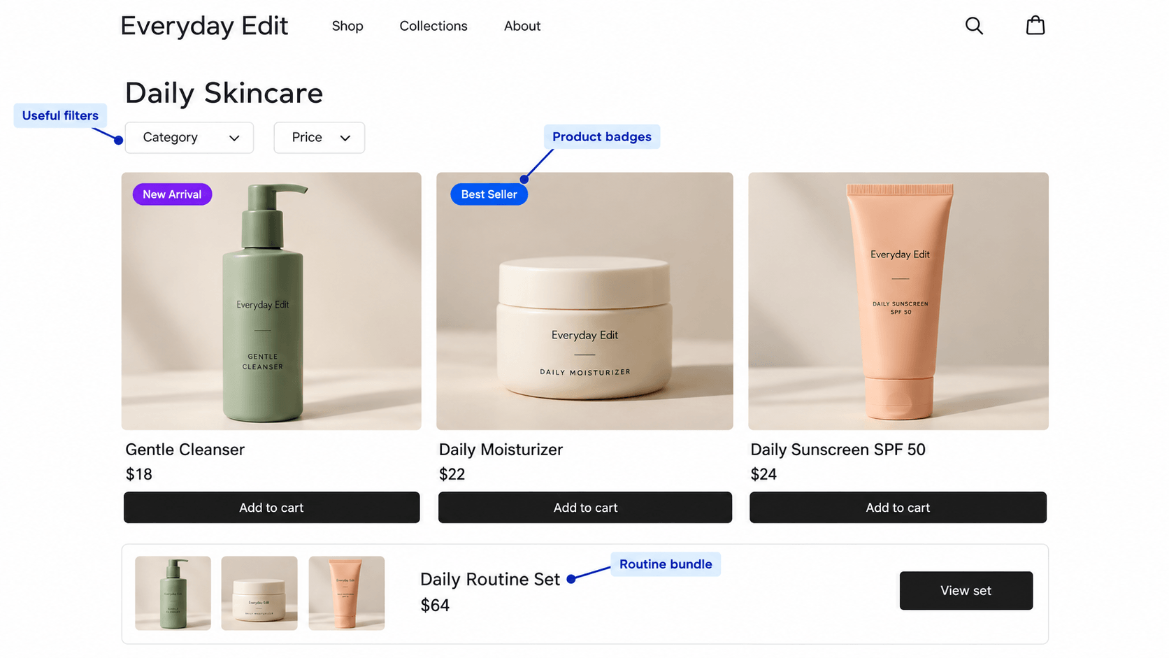
Example 3: Skincare Merchandising With Routine Bundles
A shopper wants a basic skincare routine but is unsure which products go together.
The store presents a cleanser, moisturizer, and sunscreen in a clearly explained routine collection. Each card identifies the product’s role. The pages show ingredients, directions, and the manufacturer’s stated suitability.
Customers can buy items individually or choose a clearly priced bundle. The store avoids presenting the routine as suitable for everyone or promising medical results.
The collection gives the shopper a starting point, with enough information to check each item before buying.
What to borrow: When customers need products that work together, explain the relationship instead of simply placing items side by side.
How to Measure Ecommerce Merchandising: Metrics and Testing
You have changed the product order, improved descriptions, or added useful labels. Now you need to know what happened.
Start with the question you were trying to solve. Then choose a metric that can help answer it.
Product-view sessions with an add-to-cart ÷ product-view sessions × 100
Purchase conversion rate
Are store visits becoming orders?
Purchasing sessions ÷ store sessions × 100
Average order value
What is the average amount spent per order?
Revenue ÷ orders
Revenue per visitor
How much revenue is generated relative to traffic?
Revenue ÷ unique visitors
Analytics tools may define these measures differently. Choose a definition, check that the necessary events are recorded, and keep it consistent across comparisons. For revenue measures, use the same treatment of refunds, tax, and shipping each time.
Choose Merchandising Metrics That Match Your Goal
If you add a discount badge to a collection, product click-through rate is a useful starting point. But check purchases too. More clicks do not necessarily mean more orders.
If you improve sizing information, look at cart additions and relevant return reasons over time.
If you add complementary recommendations, review whether people use them and whether order value changes. Also check profitability. A discounted bundle can increase order value while leaving you with less profit.
Test One Merchandising Change at a Time
Suppose shoppers rarely open products from a collection. You decide to make existing discounts more visible.
Record the current results, add the labels, and compare performance over a suitable period. Avoid changing prices, running a new campaign, and rearranging the whole grid at the same time if you want to understand the label’s contribution.
Traffic source, device mix, stock, seasonality, and promotions can all affect the comparison. A before-and-after result is a clue, not automatic proof.
For a store with enough traffic, a properly configured A/B test can make comparisons clearer. For a smaller store, combine your data with observed shopping tasks and customer feedback.
Do not judge a change after three visits and one order. Small numbers can swing dramatically.
Measure the problem you wanted to solve, not just the number that looks nicest afterward.
Common Ecommerce Merchandising Mistakes to Avoid
Some problems are easy to miss when you spend every day inside your own store.
Using categories shoppers do not understand. Replace unclear internal labels with customer-friendly terms. Keep creative collection names intuitive enough to guide someone new.
Using the same filters everywhere. Shoe sizes help shoe shoppers. Furniture shoppers need dimensions. Choose filters for the decision being made.
Featuring unavailable products without a clear next step. Consider moving them lower, providing alternatives, or offering an appropriate restock option.
Leaving key questions unanswered. Review repeated support questions and add the missing information to the relevant pages.
Adding too many badges. Choose the most useful message and protect the visibility of the product image.
Showing inaccurate or expired offers. Review prices, conditions, and end dates. Remove labels that no longer apply.
Recommending unrelated items. Check compatibility and explain why the suggested product is relevant.
Only checking desktop. Test actual browsing, filtering, product selection, and cart actions on a phone.
Changing everything without measuring anything. Keep a simple record of what changed, when it changed, and what you expected it to improve.
Frequently Asked Questions
A clothing store might create a winter collection, let shoppers filter coats by size and material, show accurate discount labels, and recommend matching accessories. Those choices help customers discover products and judge their suitability.
Marketing introduces people to your store and encourages them to visit. Ecommerce merchandising shapes how products are organized and presented while they shop. They work together when a campaign leads shoppers to a relevant, well-organized collection.
Visual merchandising in ecommerce focuses on how products and information appear on screen. It includes product images, grid layouts, banners, colors, and badges. The aim is to make products appealing and important details easy to understand.
Start with clear categories, complete product information, and intentional placement of available products. Then add useful recommendations or offer labels where they solve a specific problem. You can begin with manual curation instead of advanced personalization tools.
Review your categories, product attributes, images, descriptions, and collection layout first. Test the shopper’s journey on mobile. Add tools for specific gaps, such as clearer product labels, rather than installing several tools before identifying the problem.
No. Merchandising also includes organizing products, improving information, and showing useful recommendations. A store can make choosing easier without reducing its prices.
Review featured collections when stock, prices, seasons, or campaigns change. Also revisit pages where your data or customer feedback points to a problem. Set a manageable review schedule and include cleanup tasks after each promotion.
Choose a metric tied to your goal, record a baseline, and compare results using consistent definitions. Account for other changes, such as new traffic or a sale. Combine analytics with customer feedback when your store has limited traffic.
Conclusion: Keep It Honest. Make It Easy to Shop.
Trust should come first in any business. Show accurate product details, real discounts, and clear offer conditions. Earning that trust matters more than getting one extra order.
Then, make shopping easy. Your customers should not have to spend ages finding a product or figuring out whether it suits them. And of course, you would be happy to see them spend less time guessing and finally add that item to their cart.
Time is money, on both sides. Put the customer experience first: answer their questions, help them compare, and give them information they can trust.
Do not feel overwhelmed by all the strategies you could try. Pick one and start there.
Look for a question customers keep asking. If it is about size, improve your size guide. If they struggle to find an item, review your categories or search.
You do not have to solve every merchandising problem this week. Start by making one purchase decision easier for the next person who visits your store.
You put a product on sale. The old price gets crossed out, the new price appears, and the discount is technically right there. But shoppers don’t always stop to read the price. A sale badge gives them a quick visual cue that says, this product is on sale. And here’s the useful part: you don’t […]
Most WooCommerce product labels plugins can add a Sale, New, or Best Seller label to a product image. That is the easy part. The real difference shows up when discounts change, stock drops, new products stop being new, promotions expire, or you need to manage badges across hundreds of products without updating them one by […]
Open the WordPress plugin directory and search “WooCommerce,” and you’ll get thousands of results. Most store owners don’t need thousands. They need to know which plugins are actually worth knowing. The most popular WooCommerce plugin isn’t necessarily the best one. And unless this is your first WooCommerce blog ever :3, you probably already know most […]




 Samia Nasreen
20 min read
Samia Nasreen
20 min read